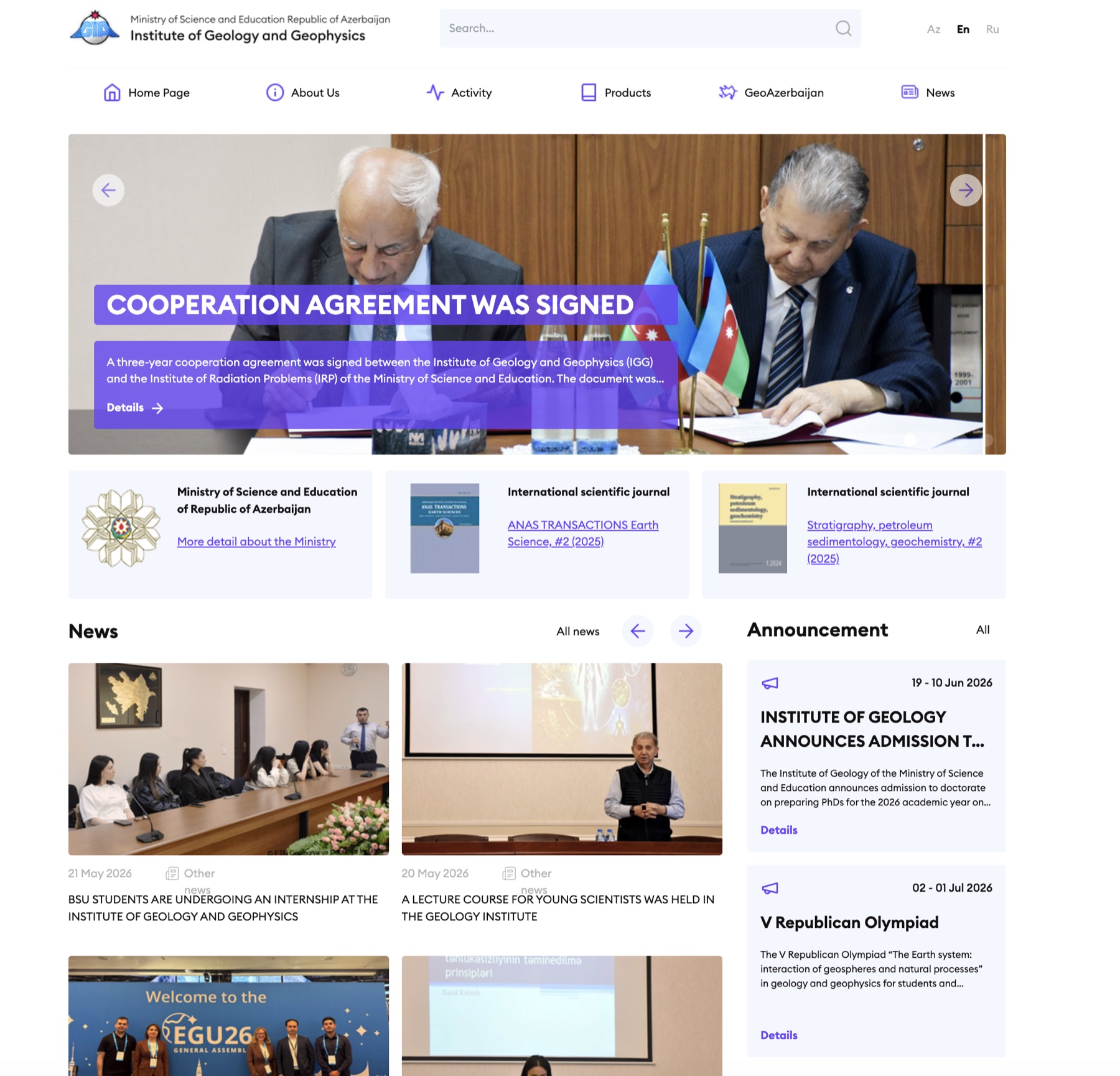
Homepage
Homepage
Opens with current cooperation news, the institute's scientific journals, recent meetings, and upcoming announcements — what a researcher or visitor needs above the fold.
Redesign of the public website for the Institute of Geology and Geophysics, operating under the Ministry of Science and Education. The new site reorganises research, publications, and field activity around what visitors actually look for.
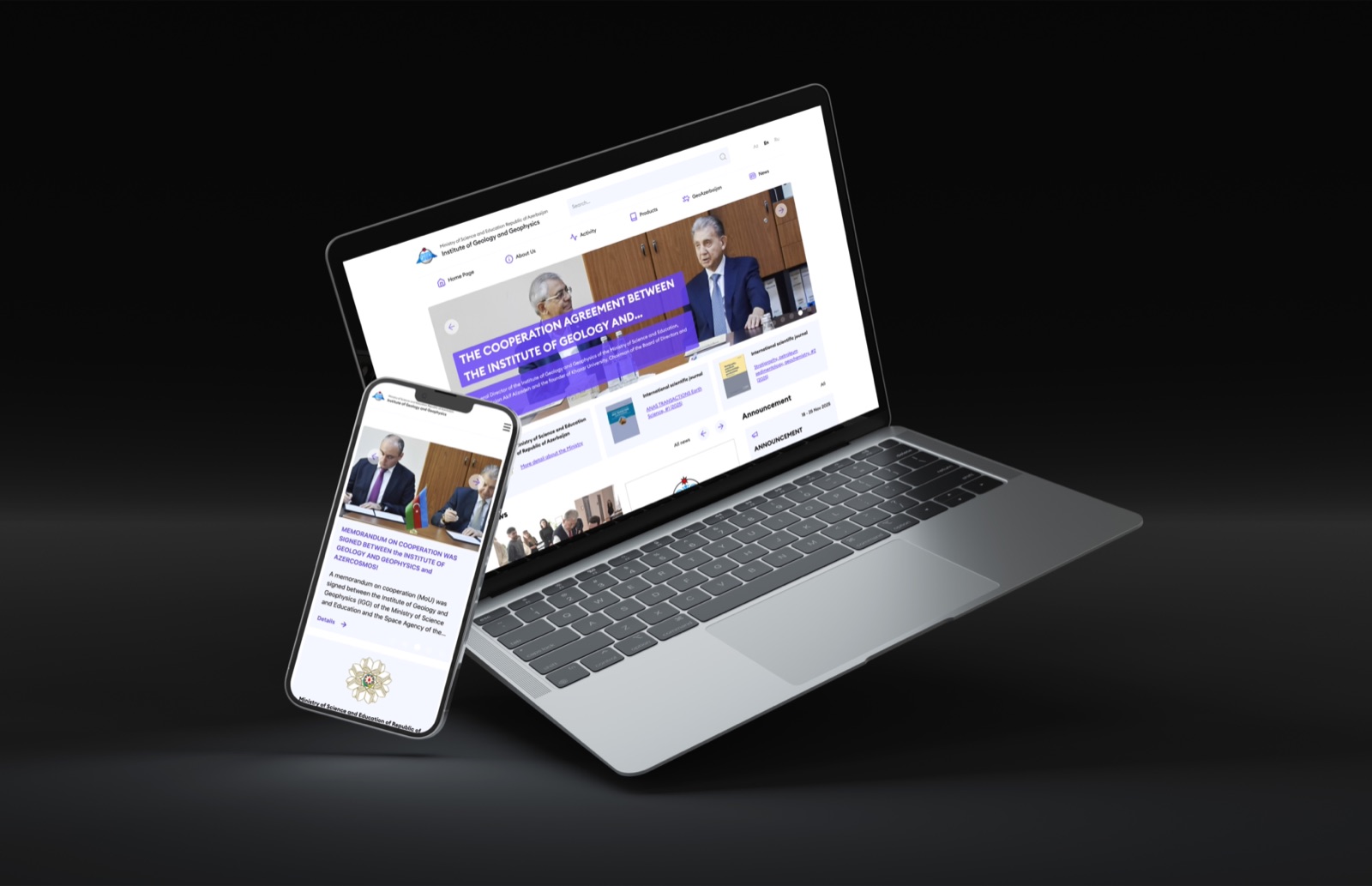
The Institute holds decades of geological research, hundreds of publications, and ongoing field observations across the Caspian region. The previous site presented this as an internal document tree. The new one organises it around four sections — research, publications, news, and the institute itself.
The site is organised around what visitors look for, not how the institute is structured internally.
Opens with current cooperation news, the institute's scientific journals, recent meetings, and upcoming announcements — what a researcher or visitor needs above the fold.
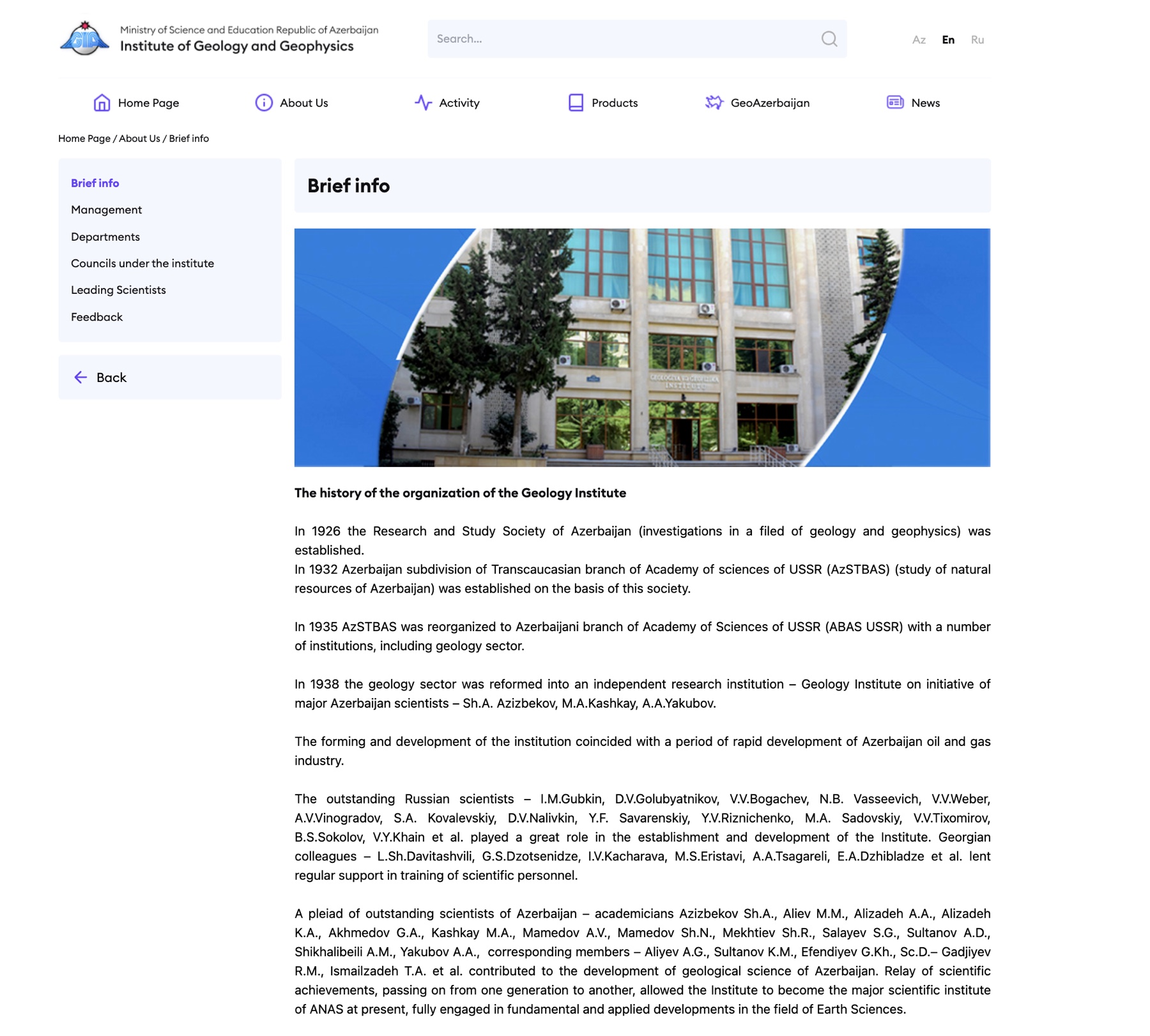
The institute's history as continuous prose, with a single hero photograph that grounds the text without overpowering it.
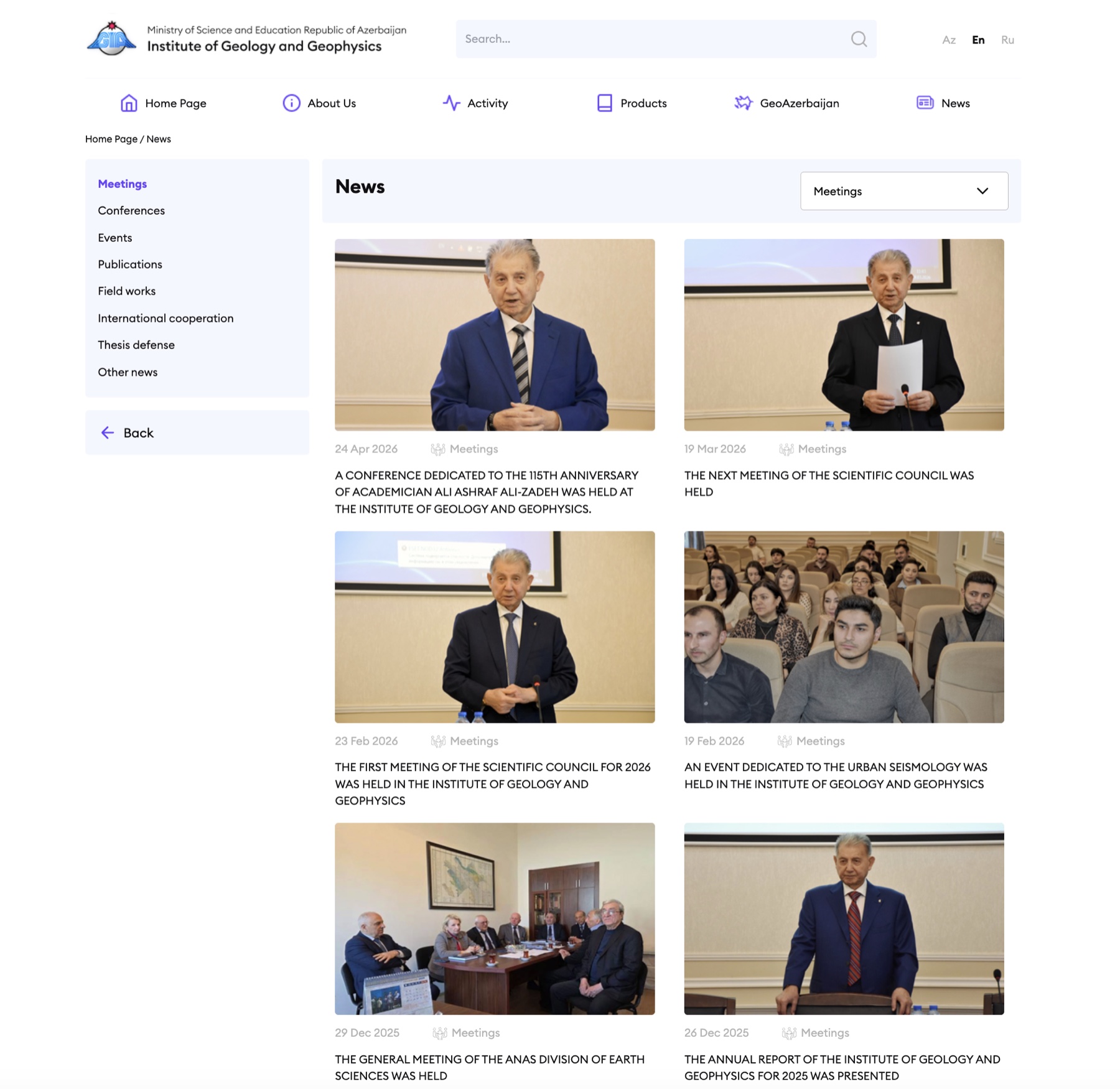
A grid of scientific council meetings, conferences, and field events — each one linked to a full report with date, location, and participants.
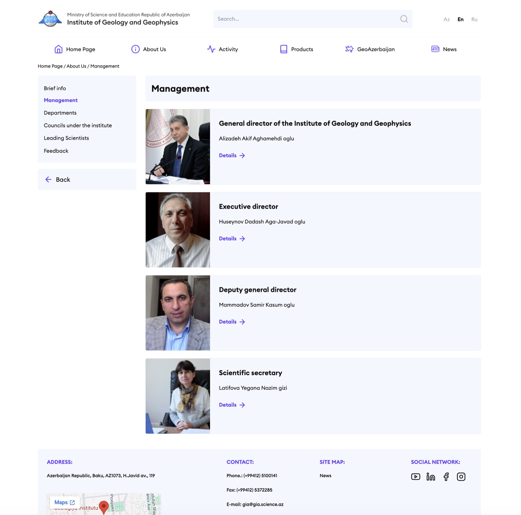
Named portraits of the institute's leadership — director, deputy, scientific secretary — each linked to a fuller profile and direct contact details.
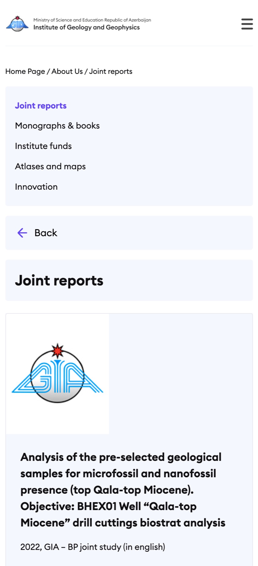
Monographs, joint reports, atlases — restructured around how researchers actually look for them. The same information architecture survives intact on a phone.
Publications, news, and contact moved to the top. The organisational chart moved down.
Page titles answer questions instead of listing disciplines. Scientific accuracy without academic jargon.
Quiet typography, limited colour, and generous spacing. Appropriate to the institutional context.
Six conversations across researchers, administration, and communications.
Mapped roughly four hundred pages, dozens of publication types, and the main user journeys.
Navigation restructured around research, publications, news, and about.
Tested with three researcher segments and a non-specialist reader.
Trilingual AZ, EN, RU. Accessible by default. A short content style guide was handed to the communications team.